Should a UI element be displayed in a menu, or through the HUD? This is a recurring question when building a UI. One that seems simple to answer and yet that has a surprisingly wide range of possible answers.
Let’s take the example of maps in games: the number of possible variations is staggering! Meta-maps taking entire menus, mini-maps incorporated in the player’s HUD, expanded mini-maps overlaying the game, compasses, world-markers, projected diegetic maps… There is no universal answer and games have widely different approaches to this topic. Some games will offer a wide array of maps: a local, zoomed-in, mini-map, an extended version for the surroundings, and a full world map in a menu.
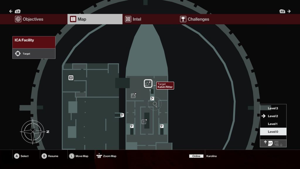
Hitman goes for two: a HUD mini-map and a level map in a menu.
Outer Worlds has three: a compass, a world-map in a permanent menu, and a universe map in your ship.
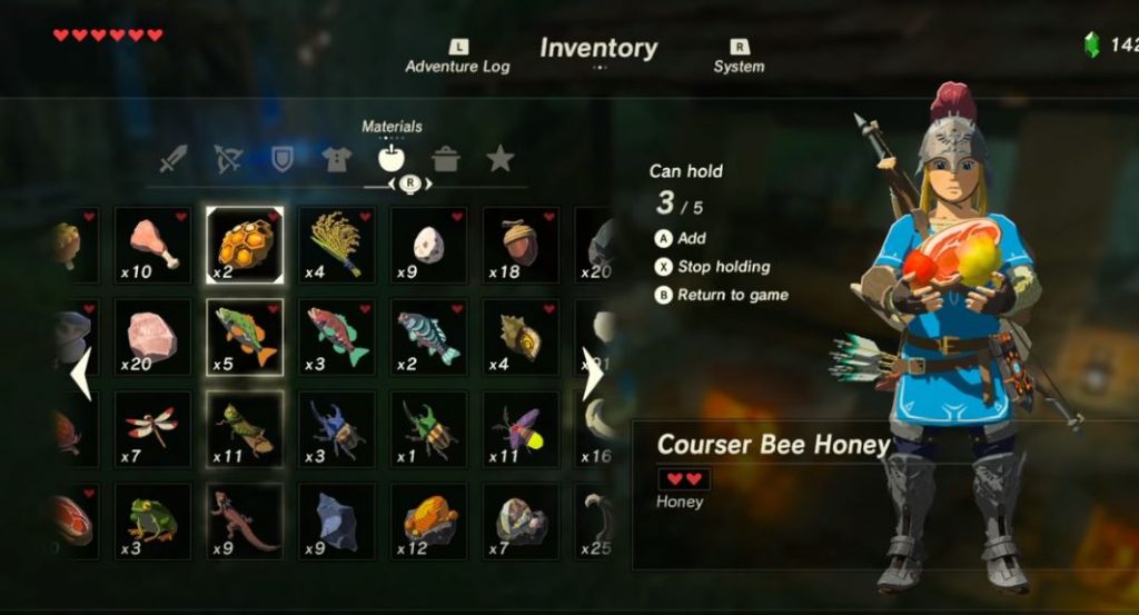
And the example of maps is interesting, as most UI elements have very generic answers among games: an inventory will almost always be displayed through a menu, a skill tree too. A bullets counter and a health bar will naturally find themselves on the HUD. A quest journal? A menu. An active quest? HUD.
But why so?
Why would developers decide to display a specific UI item through a menu, or through the HUD? By answering this question we will not only be able to spot mistakes, but also create clear rules dictating where to place elements and, finally, identify unexplored design opportunities. So let’s try and dig this!
The direct answers
“Invasive UI elements are in menus to not clutter the 3D view”
This is a straight-forward yet very valid answer. As discussed in Keys to Efficient User Interfaces, the more a HUD covers the 3D view, the more the player will feel disconnected from the game (not to mention HUD elements obstructing key-elements that could result in game-breaking moments). It is usually mindful to keep the HUD as minimal as possible and relegate crowded UI systems in a menu.
The impact on a forced HUD element is also dangerous: having to display a very detailed world-map or advanced inventory system while being careful not to cover the player’s critical focus area is bringing extra complexities limiting their design.
But this answer isn’t sufficient enough. There are always design solutions that could transform a screen-wide menu in mindful HUD elements. It’s not easy, will come with a ton of issues and concessions, but it’s feasible. Games like No Man’s Sky (in its latest version) are succeeding in displaying an enormous amount of information on the screen without taking away the connection to the world:
“In menus, the player can use all the controls”
This answer is pointing to one of the biggest limitations designers have: a very limited amount of buttons for the player to use, especially when playing on a controller. It is not uncommon for a game to have the entirety of the controller’s buttons to be allocated for gameplay purposes. In this kind of scenario, it becomes extremely difficult to free some to use in interactive HUD elements, and it is but natural to relegate them in menus. But, once again, this isn’t impossible.
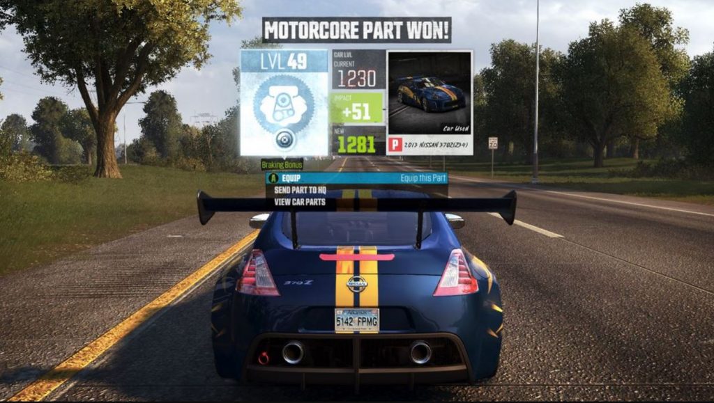
In The Crew, the gameplay core is obviously centered around the driving experience. An uninterrupted flow was of utmost importance, particularly during long cross-country road trips. But it quickly appeared that the game systems themselves were hindering this promise.
To bring variety and gameplay during these long drives, the player could trigger challenges found on the road: the player would drive through a challenge gate that would bring a bite-sized, 30 seconds gameplay segment (slalom between virtual poles, speed challenge, jump challenge, etc.). The game contained more than 500 of them and would reward the player with new car pieces to equip on his car, effectively transforming a simple A-to-B into a legit way to upgrade cars, get money and experience.
And here came a huge issue: the reward screen at the end of each challenge, which was a menu, would put the player to a halt for him to deal with upgrades, leaderboards, retries, etc. The promise of a 2 hours coast to coast perfect run turned into a hashed succession of rides separated by flow-breaking menus.
What we did was to rethink entirely this menu, and transform it into a succession of small HUD elements on top of the screen.
We worked with players and eye-tracking technology to ensure this new approach was at the limit of the critical focus area and, most importantly, we reworked the entire control scheme to make sure the player could continue driving AND interact with the UI at the same time.
After this rework, the player, when inside these moments, would lose secondary abilities (handbrake, nitro, and the D-pad radios change) to the UI interaction, while keeping the core driving abilities (accelerate/decelerate, turn the wheel, orient the camera). This small modification had a strong impact on our players as Playtests demonstrated later on.
This work didn’t stop here, as we used it to rework the entire menu flow of the game, embedding it into the flow of driving (much like what GTA does with their phone meta-UI).

This screen is a great example: giving the ability to the player to adjust every aspect and specificities of the handling settings while driving a car that would reflect these changes live.
But this answer of controls, like the previous one, isn’t one good enough. Both of them could be summed up as “Menus are for everything that can’t be put on the HUD”. This implies that the HUD is king and the menus, a fail-safe to throw all the screen-invasive, controls-heavy UI elements.
These answers are driven by the limitations of the HUD and not trying to embrace the inner benefits of each. And menus could be much, much more! Menus play a different role in the experience than simply being a convenient UI dump.
The advanced answers
Our previous The Crew example started hinting on a very important topic, one that is of critical importance for our players: the concept of Flow. Let’s consider different answers then:
“Menus break the players’ Flow and we should minimize their use”
This is a very valid issue. Every time a player needs to reach a menu, he is forcibly removed from the game world to perform a task. In the case of very specific menus, needed in rare occurrences (say, the settings menu), this won’t be much of an issue. But used for core mechanics, happening over and over through the game playtime, it becomes a burden, actively preventing the player from embracing the virtual world and its fantasy.
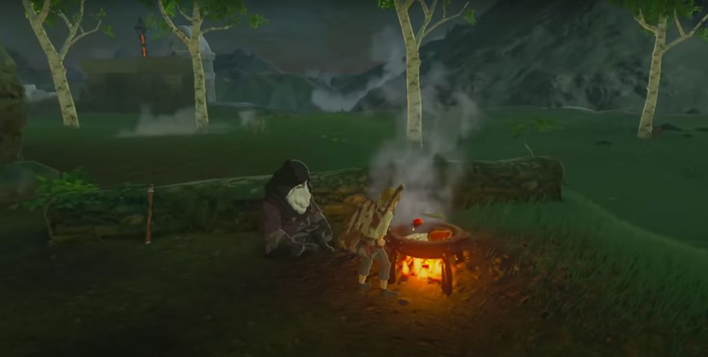
Let’s take the cooking mechanic of Zelda: Breath of the Wild. These gameplay segments are very immersive (and I do love them much): they happen in danger-free moments, are slow-paced, and drive the player to embrace the moment and experiment with a very grounded, rewarding activity: cooking.
And yet, as awesome this mechanic is, I believe the process of selecting ingredients could have been improved. In fact, cooking a recipe cannot happen without spending most of the time in the player’s inventory, picking the necessary ingredients. Should this process have happened through the HUD, leaving the 3D world visible and showcasing Link’s actions (digging through his ingredient bag, pilling ingredients on the side), the gameplay could have shined a lot more, keeping the player connected to the world and in the flow through the entire process.
Alternatively, as clunky I found Final Fantasy XV to be, I was amazed by the attention they gave to their cooking mechanic. I was connecting with the food that was prepared, each recipe grounding the world more and more. They managed to transform a buff mechanic into one of their world’s pillars, and this is not a small feat! They also have their fair share of menus, but always contextualize them while paying close attention to the flow and connection between steps.
Side note: they even created a unique segment/minigame for the player to participate in the cooking process and cut vegetables with Ignis. This is great.

You will tell me that this answer of Flow is also focusing on the limitations of the HUD and that so far I’m advocating against all forms of menus. This would not be wrong, but it is also opening a very interesting door to explore: the fact that menus take players out of the game world and action.
“Menus are pausing the moment, HUD is for live segments”
This is the first answer we have so far that really looks at the inherent differences between these 2 directions. While HUD elements keep the player in the world (and thus happen live), menus can pause the game. Historically this difference was a matter of fairness towards the player: nobody wants to get killed by an invisible enemy while studying a map taking the entire screen.
But what started as a fail-safe is actually creating design opportunities while managing our players Flow.
Menus are breathers. They are stress-free moments of preparation, calculation, and analysis. A moment to project.
There is a very important component to manage in Game Design: intensity. Players in a high-intensity moment will feel empowered, thrilled, “In the Zone”. But keeping them in this state for too long, and it will become exhausting. It may also prevent the player to set their own pace: some players rush games and are very much in a reactionary, live adaptation approach, others prefer more control, study, and analysis before jumping in an unknown situation.
While most games create breathers through gameplay (breaks between enemy waves, safe-rooms, etc.), menus are actually player-created breathers. In high-stakes games, menus can become a safe-haven for players, a moment to compose themselves, rethink a strategy in the middle of a boss-battle, or simply drink potions and activate spells without risking mistakenly using the wrong ones.
That being said, many games decided to play on that inner specificity of menus and turn it on its head. Most of them simply let the time flow nonetheless (for that “always in pressure” feeling that games like Dark Souls or Nioh are famous for) but some games really pushed it one step beyond. ZombiU became one of the best ambassadors of the WiiU for its unique usage of menus on the tablet while the game continues playing on the TV, actively asking the player to mimic rummaging through his backpack and potentially lose focus at the worse time.
Escape from Tarkov used its multiplayer (thus always live) component to turn its complex inventory system into one of its core mechanics: the player space management, knowledge of the game and looting efficiency become paramount and key-aspects of what makes that game unique.

But there is another possible answer to our “Menu or HUD?’ question. One that I find very efficient in categorizing UI elements and that looks directly at our players’ experience with each game.
The temporality answer
The player journey is comprised of many aspects, and one is of particular interest for us here: time.
The same way our players project themselves in our games through the spatial lense (“I was there, I am here, I go there”) and that it drives their needs and behavior, our players will also constantly project themselves through time.
“I need to drink that potion now or I will die”, “I’m choosing this skill because I believe it to be the best for me in the future”, “Look at all these completed camps, this is the proof of my past investment and my worth”… Every single information games display, and every single action players perform, refer to a specific moment in time in their experience.
And the careful identification of this moment is, to me, the one question we should ask ourselves when deciding how to deal with a UI element. The rest will unfold naturally.
Question: “Which moment of the player experience this element refers to?”
If the answer to this question is “PAST” or “FUTURE”, then a menu will be the best place to put it. On the opposite, if the answer is “PRESENT” (or immediate past/future), then it will be best using a HUD element for it.

Let’s look at what these different moments refer to in the player’s journey:
- Past: the sense of growth, achievement, completion, pride, involvement, progress.
- Present: emergency, reaction, micro-decisions, survival, tactics.
- Future: development, investment, delayed rewards, mastery, strategy.
Menus are here to support the MACRO level of the gameplay, while the HUD deals with its MICRO level.
And answering this question for each UI element you have will help you enormously. Let’s try it over random ones:
- A skill tree: PAST & FUTURE, deals with character development, its specialization strategy, and future playstyle = MENU.
- A skill cooldown: PRESENT, deals with tactics and moment-to-moment available tools = HUD.
- A quest journal: PAST & FUTURE, showing the completed/botched quests as well as the choice of available ones (projection) = MENU.
- An active quest: PRESENT, remind the player of what he is currently doing and fighting for/progressing towards = HUD.
- etc.
But this question can also be applied to the components of a UI element, and this is where it gets really interesting.
At the start of this article, we were talking about maps. So let’s imagine we are creating a game with 2 maps: a menu full-screen map, and a minimap in the HUD. The first thing we will do is define the level of zoom of these maps, and naturally, the menu map will be a full world map (Past & Future) while the minimap is a very zoomed-in version of the player’s surroundings (Present). So far so good.
Now let’s bring a bit more difficulties. Enemies? Sounds like something that matters in the moment (position, numbers, etc.), alright minimap. Completed enemy camps? Menu map for sure, it talks about the game’s completion and player’s progress. But at the same time, it would answer questions like “Should I go in the direction of the camp I see down the road” (present), making it a nice addition to the minimap too! Factions zones of influence? This, on the other hand, does not help in a specific situation but refers to the past and future of the experience. It would then be perfect on the world map (like what Assassin’s Creed: Syndicate did).
This approach is very interesting when deciding where a UI element should appear and works for pretty much any element you will have to deal with. When combined with user scenarios, you will even be able to project on the form these elements should take (like the difference between a minimap and a compass).
So, again, should you have one thing to remember from this article, make it to always ask yourself this question when dealing with a UI element: “Which moment of the player experience this element refers to?”
Opportunities
I’m convinced that applying this method to the game you are currently playing will make you spot improvement points and mistakes. But by challenging the temporality of each of your elements, you will also uncover plenty of uncharted opportunities!
Let’s imagine that switching from an active quest to another is a very Present player’s problem (in a game were crossroads are key for example). We could create a rotating active quest system using the D-pad that would highlight the quests points of interest live in the world (or finally use the PS4 trackpad for this purpose? So many devs forget about its existence past its mega-button function).
Another example would be on Racing games. The menu map is mostly used for one purpose: set-up my GPS on my next location. And players are doing that action a lot, breaking their flow every time they enter this map. How about making it a Present problem with a question like “I want to drive to the top of that mountain that I see in the distance”? This could lead to an awesome Ping-&-GPS system where players could physically point to the landmarks they see in the 3D view and the GPS line would recalculate automatically. This approach would also work very well with the fast-travel secondary purpose.
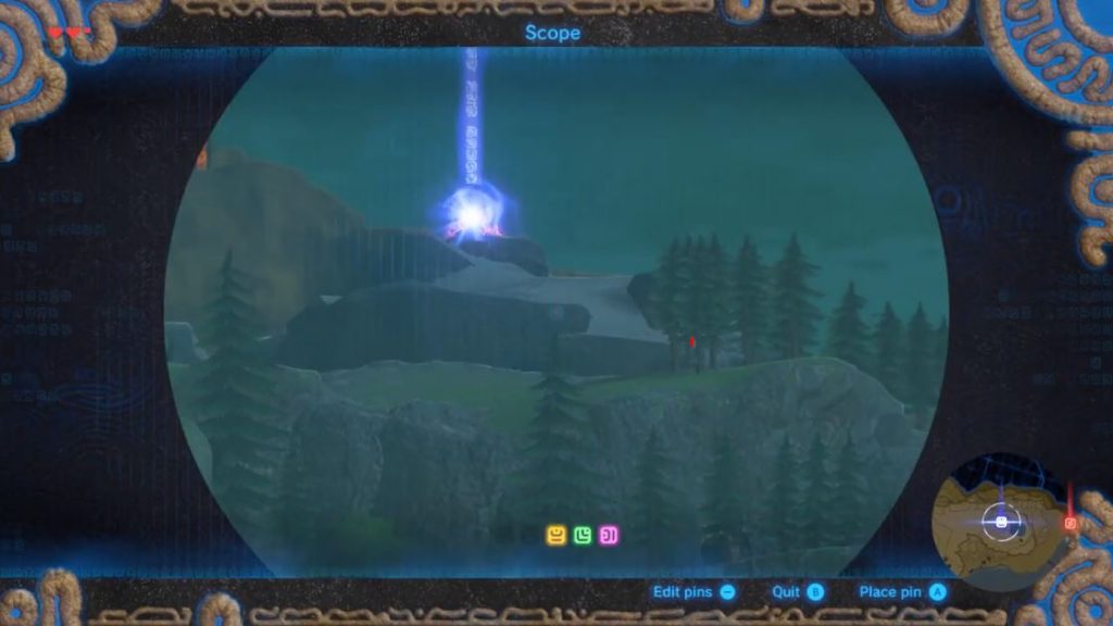
Side note: while writing this part, I remembered the awesome job that Zelda BotW did with the Sheikah slate that very much plays with this idea. This game is so good, it would be unfair to use it in an article only as an example to improve.
There is literally an infinity of possibilities when talking about UI, and settling for what every game is doing without having a good reason for it is a mistake too many games make. Can you imagine an inventory system that isn’t a menu and the game that could emerge from this simple consideration? Or a bullets counter that does not appear on the HUD? This could create really unique experience. Skybox’s the limit!
How about you? Does this approach make you think of great examples or give you new ideas? Let us know in the comments or on Discord!
Do you want to get regular quality articles on Game Design and join an awesome community of devs and designers on our private Discord to discuss design, learn, and review each other’s games? Then consider supporting GDKeys.

Share your Experience