
Talking about UI isn’t easy: the web is filled with amazing articles on this topic: accessibility, art direction, famous UI break-downs, you name it (a simple query on Gamasutra will give you months to read).

Instead, I’d like to give you my thought process while designing or reviewing a game’s UI: the questions I want to answer myself, the big categories of UI and why using one instead of the other, the tests I perform to challenge it, etc. At the end of this article, I’d like you to have a base of theory as well as your first keys to design and challenge your games’ UI!
But first, an important question you need to answer yourself every time you consider adding a UI element to your system:
Do you really need it?
There is an easy rule to keep in mind: every single part of your game needs Signs and Feedback. Everything! There are rare occasions where you’d like not to include any but they are anecdotal.
So now let’s imagine you are working on a feature and you have some information you need to convey to your players: an ability ready to be used, a “stunned” state on the player, an enemy appearing on screen, etc. Usually, this is the moment we end up hearing something in the line of “We need an icon!“, or “Let’s ask the UI artists to figure something out”. And don’t get me wrong, plenty of time this is a very legit thing to consider! The issue here is that it is the easiest answer, and you may miss plenty of other opportunities.
Mistake #1: considering UI as your only way for S&F.
UI provides indeed a lot of qualities:
- It is extremely versatile and allows for very efficient solutions.
- It is usually fast to implement and cost-effective compared to new animation sets or hungry VFX.
- It expresses itself on a different layer than the one of the game world, reducing dependencies issues.
But using it unreasonably leads to cluttered interfaces, creating a thick layer between your players and your game. Most of the time your players do not even need this information, which leads us to:
Mistake #2: displaying everything, all the time.
So before even starting to discuss the How, be careful:
- UI may not be the best way to pass this information to your players.
- This information may not be relevant to your players.
Think about the format: UI is where you put text and numbers, pictograms, widgets (minimaps, quest log…), gauges, menus, and games overlays, and plenty of other options exist to display information as developed in the article Keys to Signs & Feedback.
The 4 categories of UI
We need to start this topic by understanding that there are 4 categories of UIs, and we need to understand what they are, and why using one instead of the other:
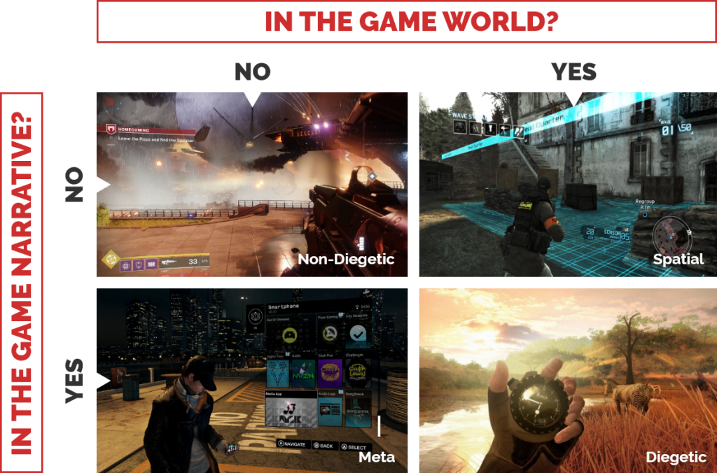
These categories are done based on 2 fundamental questions that you will have to ask yourself for every piece of information you want to display through the UI:
- Does this information exist in the 3D view of the game (the game’s world)?
- Does this information exist in the game’s universe & narrative?
Non-Diegetic
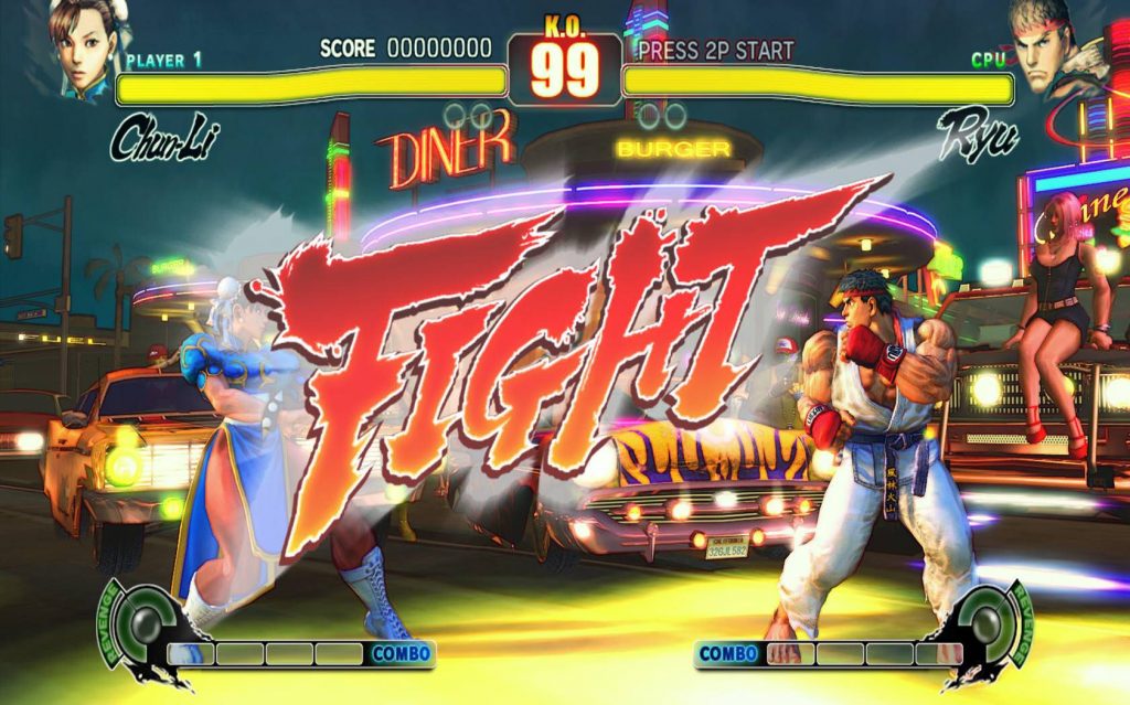
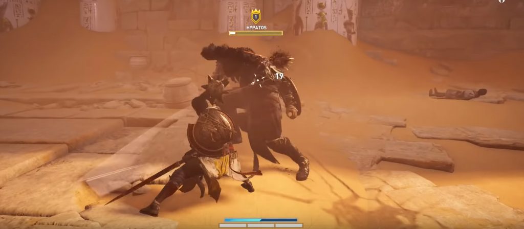
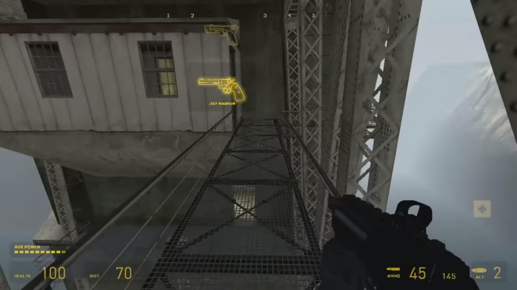
This is the most common type of UI: it acts as an overlay over the game. It doesn’t exist in the 3D view, nor does it exist in the game universe: in the Street Fighter series, neither Chun-Li nor Ryu are aware of the existence of their combo meters or the visual representation of their health.
This kind of UI is extremely convenient as it won’t be affected much by the game’s non-controllable states: whatever happens to the camera, the game’s reality, or the state of our in-game characters, the UI can take whatever shape or form we want it to be while keeping each element on a fixed position on the screen.
Pros:
- Full control over shapes, forms, and colors: protected accessibility and readability.
- It can be freely placed around the screen: smart use of corners and other unexploited screen areas.
- Independent of what happens in the game’s world: camera movements, camera shakes, explosions… There is no possible disappearance from the player’s field of view or cover-up by other game elements.
Cons:
- The denser the UI, the more you are creating a layer between the players in the game. It harms immersion and creates a disconnection with the action.
- With a fixed position on the screen, and being so impervious to cover-up as it is the first layer displayed, it can on the contrary cover critical information happening in the game, if designed with a heavy hand.
Diegetic
(NO, I won’t use a Dead Space example, do not try me!)
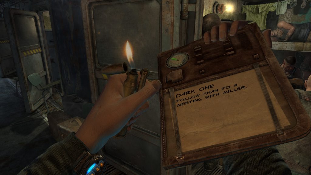
If you worked with UI before, you probably know already what a Diegetic interface means: it has been pushed for years as the next revolution in UI design, highly popularized by the Dead Space series. In short, this category contains all the game elements answering YES to both our questions: they do exist in the 3D view, and not as an overlay like previously, and they also do exist for our characters, in the world fantasy.
In our example above from Metro Last Light, the mission panel is written in Artyom’s very own notebook and makes total sense in the game’s universe. It creates a deeply believable world, one where most (if not all) of the UI is fully merged within the game’s reality. And I can’t but agree: it’s a beauty! Unfortunately, it comes with a long list of issues. The most straightforward one: what if it just doesn’t make sense?
Pros:
- The perfect immersion: the state where you are not controlling the hero anymore, but instead BE the hero.
- Reinforce the game’s narrative: how does the character in Far Cry 2 keep track of the time or orient himself? With his watch, map, and compass of course! It ties the universe pieces together.
Cons:
- In most games, this reality just doesn’t make sense. This utopia that every game could go full diegetic should they invest the time and effort in it is just wrong. I can’t see Sonic holding all his rings while carrying 3 clones of himself should he die for example (though imagining the grim “clone activation” scene, it may actually be a brilliant idea!)
- Extremely expensive to develop: more than the concept, it often implies new animations, assets, camera contexts, etc. Efforts that could be put where it matters most, in the places making your game truly unique.
- Can push the game into unwanted flows: in our previous example, Artyom can’t do anything else while checking his objective, which slows down the flow and puts him in a potentially dangerous situation. In this game, I do believe that it is a wanted behavior, and for you definitely a question you need to answer yourself.
Spatial
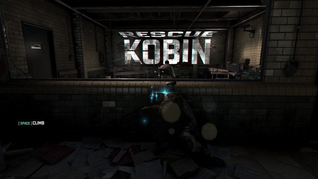
These two remaining categories are less exploited but very interesting nonetheless. Take this example from Splinter Cell: Blacklist. The objectives and tutorials are directly displayed in the world and not only create a one-of-a-kind UI, but also anchor the world and drive the player better than any objective marker.
This UI category exists directly in the game world while remaining at the player’s discretion. It creates either a very cinematographic effect (can you think of movies using the same principle?) or helps your players orient themselves a lot better. Example: Left 4 Dead 2 highlighting teammates through the game’s geometry
Pros:
- Anchors your world and gives consistency to it.
- Creates a visual connection between a piece of information “your teammate is down” and its location “on the roof, pretty far from your location”
Cons:
- It can be missed: as they exist in the world, you have little control over where your players will look. They will work perfectly on very linear games or segments (i.e. when you are 100% certain your player will see it) or when it is part of the core loop (like how you need to be constantly checking on your teammates in L4D2)
Meta
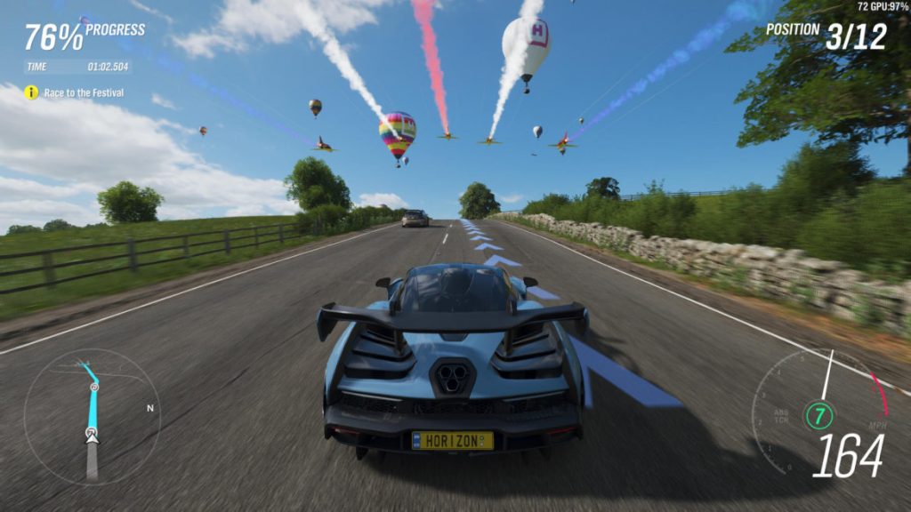
This last category is to me simply an evolution of the non-diegetic UI. In short, it doesn’t exist in the world (i.e. it is part of this layer above the game) but makes sense in the game’s fantasy. In GTA5 for example, where would Trevor get access to his missions or map? On his phone of course! And in Forza Horizon 4, why not represent the car’s speed with a speedometer?
See it as an opportunity! Evolving a non-diegetic element into a meta one reinforces your fantasy and helps your players make sense of your world.
Pros:
- Same as the non-diegetic ones: creative freedom, protected layer over the game, and independence from the game world…
- … plus a very good way to ground your world and fantasy!
Cons:
- Same as the non-diegetic ones: potentially hurting the immersion with this extra layer, or covering critical game information…
- … minus the risk of overcrowding, even more, your screen: a speedometer will take a lot more space on the screen than a simple gauge or number. A fake phone interface will always need some extras. This is a decision for you to make: is your element so important in your fantasy that you are willing to clutter your screen for it?
Now that we have our 4 categories, I’d like to focus on some tips and tricks that helped me challenge my UI systems over the years.
Protect the core of your game
Every game has very unique critical focus areas. What I’m talking about here is the zone on the screen that MUST remain un-cluttered whatever happens! This is the zone where the most high-stakes moments happen for the player: it can be a challenging platforming sequence, an aiming and shooting moment, the horizon in a racing game… All these moments that, if occluded, will ruin your player experience.
Defining them precisely could be done with an eye-tracking study, but you probably do not have the material, time, or energy to do that… So let’s use a designer’s best tools: intuition and experience!
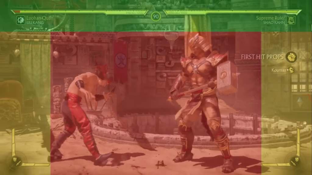
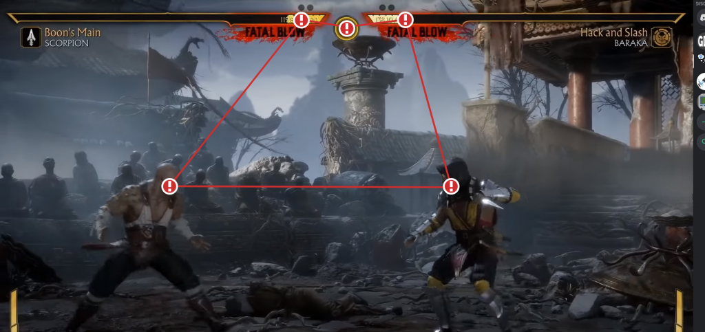
In a fighting game like Mortal Kombat 11, the critical focus area (in red above) is very straightforward: as the entirety of the gameplay is animation-based, it is critical to have a constant view of each character and the zone between them. As expected, no UI will ever temper with that area ( i.e. once the match starts of course). The orange zone, yet not critical, is still an important one as it highlights the boundaries of the arena. It is then reserved for either light UI elements (located in the corners) or non-permanent highlights (kounters, points, etc.). Finally, the green zone is our safe space where heavy, permanent UI can be displayed without risks.
You may point, rightfully, that this is not a matter of chance but more because of a carefully designed camera context.
If you’re having issues with your critical focus area, think about tuning your camera (angle, zoom factor, depth of field) or using the spatial & diegetic category to merge your UI into your world!
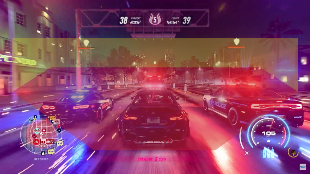
In a racing game like Need for Speed Heat, the critical focus area is a diamond shape encompassing the horizon, my direct surroundings, and my car. Why the car? Because this zone isn’t only about gameplay, but the core of your experience. Letting the player get a premium view of his car is a must-have to engage them in your core experience.
Defining this area, which will be highly specific to your game, will help you enormously design the position, shape, and size your UI will take.
Key #1: Identify your critical focus area (you may have multiple depending of the game segment) and organize your UI accordingly.
Combine all 4 categories
Let’s put one possible worry to rest: you can use the 4 categories of UI, together, at the same time, without any limitation! No need to pick one and stick to it: instead, ask yourself for each element which category would fit the best and roll with it!
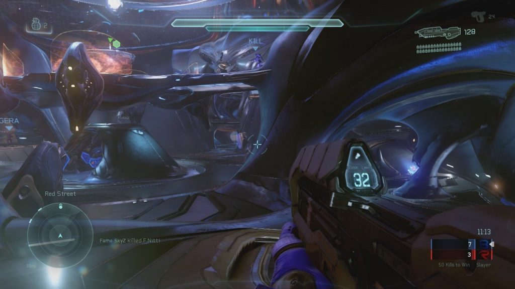
If you still doubt it, have a look at the in-game UI of Halo 5 displayed above: this game uses all 4 categories, at the same time and yet has an extremely slick UI!
- Non-Diegetic: match advancement (red vs. blue team, time remaining), crosshair, mini-map, and gear (if you consider them out of the narrative)
- Diegetic: bullets and extra display on the gun itself
- Spatial: objectives, allies, and enemies markers in the world
- Meta: HUD information, like the shield widget on top of the screen
Key #2: Mix and match categories without limitations. For each UI element, pick the one that makes the most sense.
Display only relevant information
Remember Mistake #2: displaying everything, all the time? This is, to me, one of the most common mistakes leading to a cluttered screen and a messy UI perception.
The reality is that your players need only very little information at a specific time, and displaying irrelevant information will only lead to confusion. Take Assassin’s Creed: Origins: the health bar of the player and the enemies, which seems to be a critical piece of information to display at all times, is instead displayed only during conflicts.
By deciding to hide it outside of conflicts, the game lets more important UI elements shine while emphasizing that not everything in the game is about combat. It relates to the game’s core experiences. (Side note: Assassin’s Creed has a strong “less is more” philosophy relative to its UI)
You need to ask yourself, for each of your UI elements, when and why it makes sense to display them. Define rules for having them appear or disappear (toggle on button press, always displayed, fade-in fade-out (parameters?)).
This opens the door for bigger talks about game contexts: moments (fighting, exploration, dialogues, parkour, investigation, etc.) that require specific controls, camera setup, rules, and, you guessed it, UI.
You know the saying: “If everything is important, nothing is important“. This applies very much to our topic here, and I like to use a simple trick to see how UI can affect the legibility of a screen: pick the brightest/ugliest color you have and overpaint your entire UI. Is the game still pleasant to play? Is it still usable?
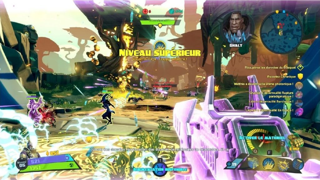
This is a screen from Battleborn, plenty of information seems very unnecessary in this scenario, from tutorials to story characters avatars and prompts. Well, let’s repaint it and see what we get!
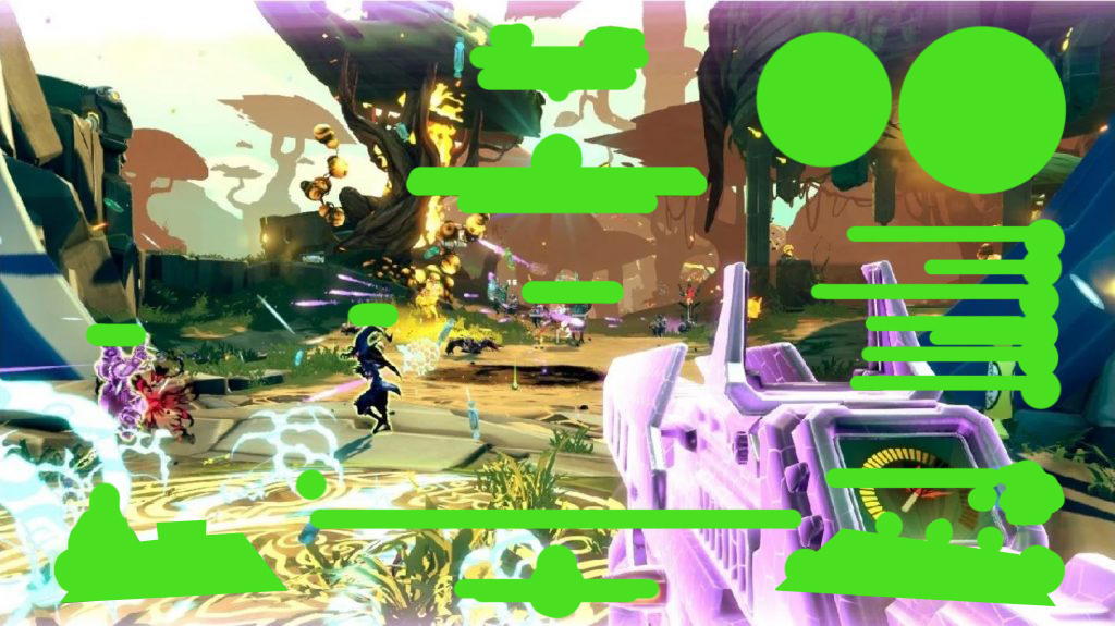
What do you think of that screen? Would you enjoy playing the game? Can you play it efficiently (visibility, accessibility…)? If not, you may have some trimming and redesign to do (and yes, I took an extreme example, but doing this exercise will teach you a lot!)
Key #3: for each of your game’s context, display only what matters at that specific moment. Do not hesitate to hide core elements if the player has no use of it.
Design for minimum eye travel distance
This part is both very straightforward and simple to misinterpret: in short, a good UI minimizes the eye travel distance over the screen. This has to do with the player’s comfort, of course, but not only: by grouping elements on the screen, you create a visual connection between them, making it easier for your players to build mental models over these elements.
One easy mistake to make is to assume that the most important need to be located in the middle of the screen, and the least important ones in the corners. Many games have a critical focus area in the middle of the screen, making, indeed, elements appearing them more visible.
But the key here goes beyond physical location on the screen: it is about flows.
In short: what connects different elements together and how does the player bounce between them? Fighting games, for example, understood long ago how important this topic is.
One very important moment is the end match: Both players are running out of life, the timer is ticking its last seconds… It’s a very tense moment where a small mistake can cost them the victory. A player, on top of focusing on the fight itself, needs to extremely quickly check the timer and both player’s health. This is the main reason why health bars are emptying towards the middle of the screen, being so close to the central timer.
This is a perfect example: designers understood the players’ flow at that specific moment and designed a compact and extremely efficient UI around it, to the point it became the norm in fighting games.
Key #4: do not think in terms of physical screen’s location, but instead in terms of player flows: specific needs at specific times.
Be mindful of the weight of your UI elements
This is given in any design discipline: be mindful of the visual strength of your elements. Too subtle and the player will miss it. Too strong and you will shift the experience towards these elements, breaking the immersion in the process.
One reference that is widely regarded as a precursor in good UI design is Half-Life 2 that managed with a minimalistic, yet extremely efficient UI. Its monochrome beige UI became one of the most recognizable elements of that game.
Key #5: Iterate on the visual strength of your UI and the balance between an invisible UI and an overwhelming by prioritizing elements based on your pillars and players needs and motivations.
Consider your worst-case scenarios
You may have in your game some variable UI systems: an expandable text-chat widget, a notification system pilling them up one over another if multiple get received close to each other, or a kill-log or quest-log that could get out of hand in some extreme scenario…
If this is the case, always consider them at their worst, and judge your UI based on this result: many players will find themselves in this situation at a point or another, and at worst it could ruin their experience (I have seen notifications system ending up covering some critical buttons making them non-interactable while the notification is displayed)
Alternatively, a worst-case scenario could be the absence of many of these elements (onboarding, specific gameplay sequences, etc.) that may leave your UI elements floating and unanchored.
Key #6: Make sure to integrate limitations and safeguards in case your UI goes into some extreme scenarios (example: a maximum number of notification displayed at a specific time).
Finally, never forget
Did you enjoy this article? If so, please consider supporting GDKeys on Patreon. It helps keep this place free of ads and paywalls, ensures we can keep delivering high-quality content, and gives you access to our private Discord where designers worldwide gather to discuss design and help each other on their projects.

Leave a Reply