One of the most important goals of GDKeys is, and will always be, to provide support to indies, students, and designers on their games, prototypes, and problems. It can be through direct feedback on our Discord channel or more in-depth analysis and proposals when the topic is wider and would benefit others as we did with The Unique Selling Point of Weaving Tides.
One of the games we support, Fairtravel Battle, came with an interesting topic to tackle: at its core, it’s a competitive card battling game in the line of Hearthstone or Magic: the Gathering Arena. How do you design the User Interface for such games? What makes the UI/UX of the best competitors so efficient? What can we learn from them?
To answer these, we jumped on Twitch some time ago for a deep dive into these games and a Live redesign of the UI of Fairtravel Battle:
For those of you who do not have 2.5 hours to watch the entire stream, and to provide a digest of what we discussed, here are the biggest takeaways from the stream.
Fairtravel Battle
Fairtravel Battle is a great card battler, designed by a solo dev, with an insane scope. As summed up by one of our Discord members:
Fairtravel Battle is a collectible card game that brings new game modes to a well-proven format. Enjoy custom PvE modes, surprisingly fresh mechanics and modding support without being limited by microtransactions – buy once, get all the cards.
The best part of it? The game is accessible for all to play during its development. So instead of describing it more, I invite you to jump on the game’s itch.io page, and try it yourself, or go and hit their Discord!
- Fairtravel Battle itch.io (playable)
- Fairtravel Battle Discord
- Fairtravel Battle Steam Page
- Fairtravel Battle Reddit
And with this introduction, let’s dive into the depths of User Interfaces!
UI Design IS Game Design (8:08)
More than most genres, UI in card games is paramount. This is due to multiple factors:
- The entirety of the experience rests in most cases on the pillars of its physical counter-part: board games.
- This physicality leads to a diegetic heavy approach to UI.
- The UI is then not only a pillar, but also the main vector of fantasy and structure of these games.
In most games, UI, as every means of Signs & Feedback, is serving the Game Design. But on a few genres, like turn-based strategy games or, in our case, card games, the UI and Game Design share the same responsibilities and the user experience will constantly bounce back and forth between these 2.
Derek Sakamoto, Hearthstone Senior UI Designer, made a great talk a few years back to share his experience on how important UI design is:
It is very impressive to see how much UI research and design impacted the final game:
- The physicality of “The Box” led to strong constraints. One of them, physical size, led to the now-famous 7 minions limits (the maximum amount fitting on a single line on the board).
- The “chain” ability (equivalent to the instant spells of Magic: the Gathering (MtG) was leading to pilling flows (chaining chains) and got cut for a more streamlined experience.
- The 30-card limit per deck appeared after noticing the UX complexities of building a 60-card deck digitally.
This talk is great as it really highlights the importance of UI design as a game-shaper from the beginning of the project. And I believe it is well illustrated by Hearthstone’s early prototypes and iterations:
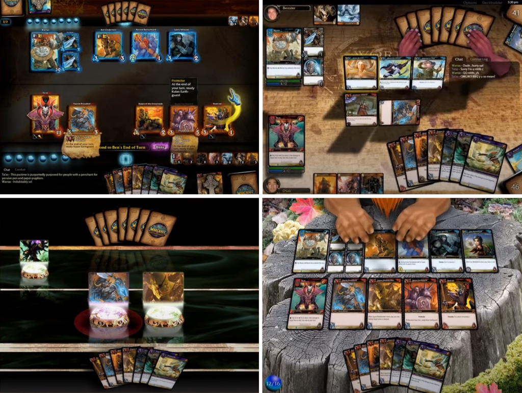
With that in mind, and before iterating on the UI of Fairtravel Battle, we will study the board design of 3 killer games, la crème de la crème: HearthStone, Magic: the Gathering Arena, and Legends of Runeterra.
Benchmarks and Studies (14:41)
All 4 of these games face the same macro problem: all of them need to display a very important amount of information on a small surface. Zooming in and panning the board would lead to a terrible experience and expanding the board (i.e. force zoom out) would greatly hurt accessibility. This meta-issue is actually cascading in a myriad of smaller ones: how to deal with over-crowded boards? How to clearly define play zones for an organized experience? How to visually group elements together when negative space is a luxury? How to ensure minimum eye and mouse travel distance (i.e. grouping of flow-related elements)? How to showcase complex cards, with several lines of text, in a readable and non-occluding way? etc.
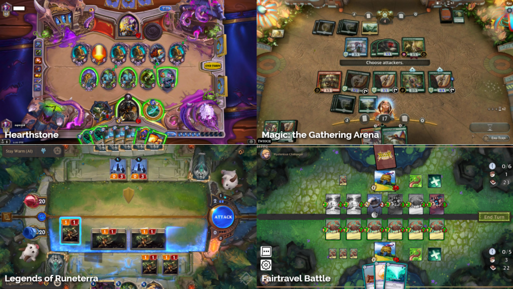
Interestingly, each game found very clever ways to deal with these issues, all in their own specific way, and they are going to be extremely useful while redesigning the board and experience of Fairtravel Battle.
Hearthstone

- Hearthstone’s most interesting design decision is how much of their board they “sacrifice” to their fantasy (“The Box”). Space is critically valuable, and yet almost half of their board is dedicated to non-gameplay elements (or “non-critical” gameplay elements as some of them are interactive). The team at Blizzard considers that the fantasy of the game is almost as important as its gameplay.
- We have beautiful “Hero Corners”. I call Hero Corner the zone dedicated to the player’s belongings: avatar, health, weapon, ability, cards… These corners are arc-shaped, protecting the central hero, and emphasizing the battle.
- The unit area is extremely defined (thanks to the 7 minions rules imposed by UI), with enough negative space, leading to clearly defined zones as per Gestalt laws.
- The game follows a very clear Western progression, from the left to the right of the screen. The past is on the left (history), the present is in the center (the board, the cards to play), and on the right comes the future (the mana to play cards, the button to move forward with the game). Interestingly, they kept the players’ decks on the right. Decks are usually considered an element of “the past” (the place I picked my cards from) and thus placed on the players’ left side.
- Cards placed on the board take a completely different shape, reducing their information to the bare minimum and saving much-needed space.
Magic the Gathering: Arena
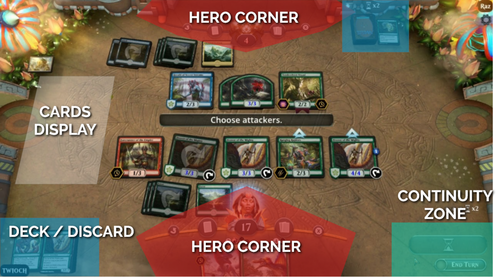
- MtG pushed a lot less of its fantasy through the game’s board, which stays extremely wide and empty. One strong reason for that is the huge number of cards that can end up on the board, on multiple lines: the game needs as much space as it can shave. This leads to plenty of smart decisions:
- Each card takes its condensed form when on the board, and identical cards will stack.
- The Hero Corners are a lot more condensed, the enemy one kept at a strict minimum (follow turns, life, counting the number of cards in its hand).
- Decks / Discard and buttons to continue the fight moved in the corners (note that the left-past-right-future flow is kept).
- The subtle camera perspective not only gives more physicality to the board but also makes the player’s side bigger than the opponent’s (60% to 40%), which I believe helps feel in control and empowered.
- As most of the board will stay empty for many turns, the left side is used as a big display of the cards played by the enemy, avoiding any unpleasant occlusion of the board.
Legends of Runeterra
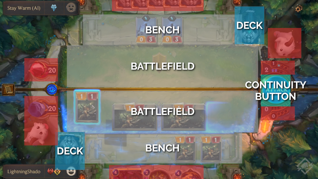
- Legends of Runeterra went for the best of the 2 worlds: on one side having huge unit areas, as the game has a system of bench plus battlefield, and on the other anchoring heavily their fantasy onto their board. To achieve that, they reduced most of the other elements to the bare minimum: cards are barely sticking out from the edges of the screen, decks are minimized, and manas are just ticks around the main button… Considering the importance of projecting on a fantasy, these choices are very legit when applied to the game’s logic but come at the cost of accessibility.
- Then comes the Hero Corner… Which isn’t a corner anymore: the Nexus (player’s health) is on the left side, next to his Guardian. The cards are at the bottom, the Mana circles the right button, and the opponent’s minion isn’t symmetrical… To me, this is a big design flaw. It dilutes the information, makes my eyes constantly bounce around the screen to look at very small elements (what was at first a smart decision comes with its downsides), and confuses the player.
There would be plenty to discuss on this last example and some interesting design propositions to make, but it is time to have a look at Fairtravel Battle. We will study the current board design and apply our previous findings to it.
Fairtravel Battle Board Redesign (29:38)
Current Design
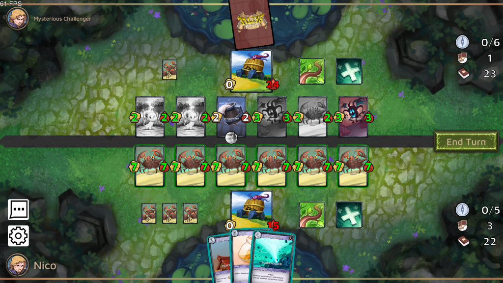
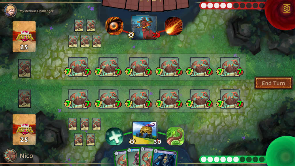
Here is a screenshot from a game of Fairtravel Battle. If we study it the same way we looked at the previous 3 games, while keeping in mind their key features, several improvement points become immediately apparent:
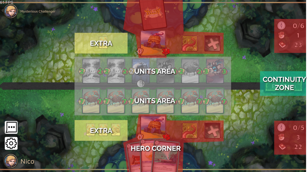
- The Hero Corners are stretching, making the hero’s abilities disconnected (and looking like cards).
- They also spread too deep toward the center of the screen, leaving little space for the cards to be played.
- Because of that, units areas are cramped, and positioned so close they become indistinct from one another.
- The cards keep their original shapes when placed on the board, eating from the vertical space of the screen.
- There is a lot of unused space on the left side of the board.
- Several pieces of information (number of cards in decks, mana, etc.) are spread far from the Hero Corners. Also, they are displayed as non-diegetic UI, making them floaty and unanchored.
- These 3 stats are also displayed with the same importance while the reality is completely different: Mana is one of the pillars of the gameplay, the deck’s remaining cards number being far behind, while the hand’s remaining cards is a duplicate (players can see both hands at all time, thus can count remaining cards).
- The board is lacking fantasy, missing the opportunities to anchor the universe and tie the UI in a consistent whole, like with the Mana.
- The reaction chat, usually part of the Hero vignette, is sent to the left side of the screen, next to the parameters button. Not only they are taking up a lot of space, but they are also badly positioned based on games’ usual codes.
Also, there is another critical point to improve: each turn, the player may play a card, either by dropping it on the board, discarding it for a new card (redraw) on the right side of the screen or for extra Mana on its left side. This isn’t only missing physicality but also goes against the natural flow of the game (remember the left-past-right-future logic).
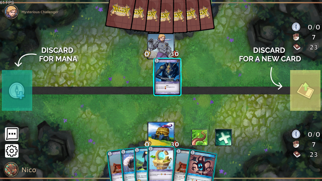
So let’s mock up what could be simple improvements and quick wins.
Redesign (39.24)
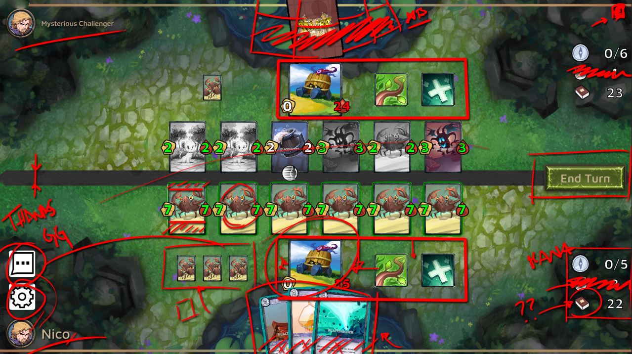
Below is the redesign we did Live, considering a worst-case scenario (full board):
- Hero Corners have been tightened on the screen edges, freeing necessary space without sacrificing accessibility and functionality.
- Heros’ abilities now surround the hero, giving a clean overall shape and direct connection between the elements.
- Units on the board are displayed as squared tiles, once again shaving space.
- The battlefield is visually defined, suggesting the unit limit (6) on the board while anchoring the units on the field.
- The Decks (and newly added discard) are now displayed on the left (past). The card counter is displayed on them, and these decks become the place to drop a card for a redraw, tapping into physical board game usage.
- Mana is visually represented while staying close to the player.
- The Mana crystals are tied to a “Mana Vortex”, a physical pit on the board to sacrifice cards for mana: it legitimates the board and the feature with a tangible addition.
- Parameters are moved to the upper right corner, while the reaction chat is integrated back into the hero tile itself.
As you can see, there is still space left on the right side of the screen: opportunities to make the Mana system even more prominent, add new cards, or create a visually stronger “button”.
This proposal could now be given an art pass (defining the battlefield limits, finding the right visual representation for the Mana card dump, etc.)
Card Design (1:39:33)
During this Stream, we also talked about the main features of good card designs in terms of accessibility and UX. And once again, different games take very different directions! We’ll study our usual 4: HS, MtG, LoR, and Fairtravel Battle.
Benchmark and Studies
So… What are the most unique and efficient traits of good cards?

For Hearthstone, it’s about maximizing the digital benefits:
- Descriptions are non-existent (they will be displayed in tooltips when players hover the cards)
- Mana cost, health, and attack values are extremely visible, popping outside the frame of the cards. Cards aren’t bound to their rectangular frame anymore.
- Generous display, thanks to the space saved.

For Legends of Runeterra, it’s about minimalism and distinctiveness:
- Units are showcased with beautiful full-frame illustration, their name in big displays.
- Spells barely look like cards anymore, clearly separating them from the unit cards. They also allow more space for a description
- Each value is an inherent part of the card frame, contrary to the Hearthstone approach.

For Magic: the Gathering Arena, it’s all about mana colors and tradition:
- Cards in MtG haven’t changed in 2 decades. They are prime examples of physical games and digital games having clearly different sets of codes. The UX of these cards is terrible for a video game, but keeping them as they are is making sure to not alienate millions of players around the world. This particular challenge surely drove most of the specifics of their board as we have seen.

And, finally, Fairtravel Battle. What could we apply from the previous examples to make these cards shine more? Well, I’d propose:
- From Hearthstone: popping elements! Mana cost, damages, and life value. These are the most important, these are the ones that should shine more than anything else, and for now, they barely exist.
- From MtG: distinct colors per card category! light grey, light blue, and light purple are way too close to each other. They need to pop, with clearly distinct hues.
- From Legends of Runeterra: grids and layout can vary! Each category of cards could wield a different layout, emphasizing their uniqueness. Descriptions can stay minimal.
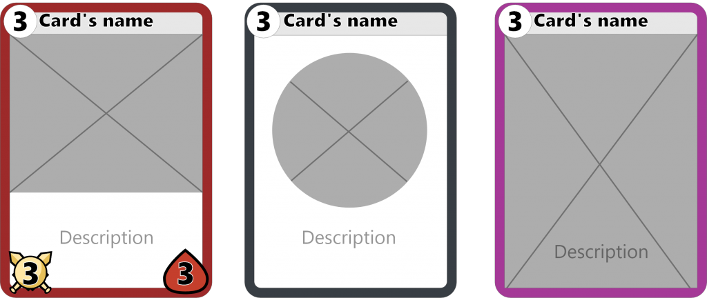
(Note: Fairtravel Battle wants to also be produced physically. With that in mind, breaking from the rectangular frame or from the usual card format would raise significantly the costs, thus why not advise here).
Of course, this is but a glimpse of everything we discussed during the stream. In it, we also discuss UX rules, Tooltips design, Accessibility tests, Victory/Defeat screens, and much more. So make sure to check it out if you are designing a card game yourself or are simply interested in the tips and tricks developers use while creating such games!
Feel free to also join us with your own designs, or card games: you’ll always be welcomed!
Did you enjoy this article? If so, please consider supporting GDKeys on Patreon. It helps keep this place free of ads and paywalls, ensures we can keep delivering high-quality content, and gives you access to our private Discord where designers worldwide gather to discuss design and help each other on their projects.

May 18, 2020 at 6:26 pm
Thanks for the article, pretty interesting!
December 29, 2023 at 4:21 pm
Very nice article, thanks!